Thanks Gary! It hopefully helps someone and maybe someone can take it and improve it.
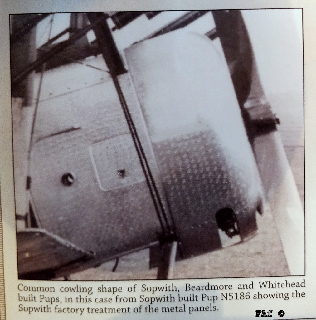
Richard; I both agree and disagree with you. Based on my source, yes I know it's just the one but at least it is contemporary and of a Pup, the pattern is actually smaller than what I've done and quite regular even if it isn't quite as regular as mine... See below (Source: Wingnut Wings, Sopwith Pup RFC, p. 12 and I do apologise for the fact that my FAf (C) is on it, it is absolutely NOT my copyright).
In my view, building models is about creating a convincing likeness of the original. Sometimes this calls for the builder to do things in a way that can't be found on the original, e.g. highlights, using several shades of the same colour to break up large areas, etc. I'm happy in many ways with my representation of the above. When I look at it in reality and at a greater distance than the extreme close-up photos show, then it looks really good. But I am still wondering if it could be worth my time and effort to redo it anyway?!
I'm thinking that I could try and make even smaller circles. I think it'll have to be circles even if the original marks aren't circular. Put it down to the limitations of the machine. I'm also wondering whether I should try with other colours. Two options come to mind here - 1) dark aluminium and lighter dots but less contrast than now or 2) switch it around and have a lighter cowling and lighter dots.
The second approach is contrary to the above image, but the result could be better and therefore "correct" according to the idea of creating something that looks right when finished, rather than something that is done the right way but looks wrong.
I'll probably do some tests off subject and then decide on whether I should strip it back and redo it.
Comments and suggestions more than welcome!
/Fredrik