Be advised this isn’t strictly modeling, but it
is still on the red/blue theme and I thought some of you might find it interesting to get a glimpse into the decal-making end of Projekt Eindecker. I took a few hours last night and today to prepare the vector art for the stenciled lettering that’s going to go on the wings, fuselage, and inner wheel covers, and one of the elements I’ve really been looking forward to creating is the stenciling that appeared on the wingtips (which now makes sense, thanks to Mike Norris),
Rote Spannlössen nicht öffnen and
Blaue Spannlössen öffnen—“Don’t open the red turnbuckles” and “Open the blue turnbuckles”. I couldn’t find a decent picture of the actual lettering, so I started with a photo of one of the New Zealand E.IIIs from Jamo’s SmugMug page, which I imported into Photoshop:
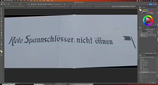
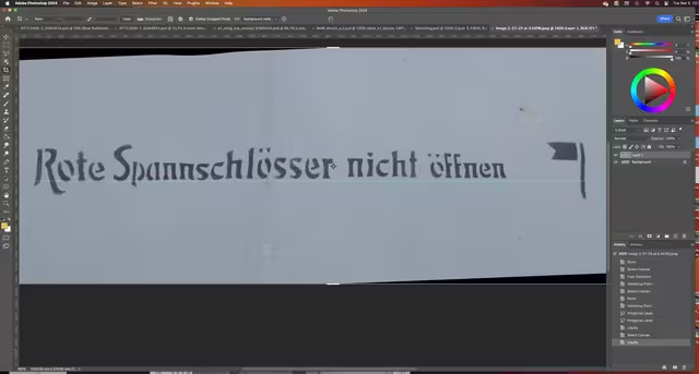
… and then manipulated until it was kinda-sorta on a straight line:
After that it was a matter of laying out a couple of guides to establish the size of the letters, then using the Pen tool to “draw” each one… actually outlining them with a path made up of mathematical control points connected by combinations of straight lines and Bézier curves:
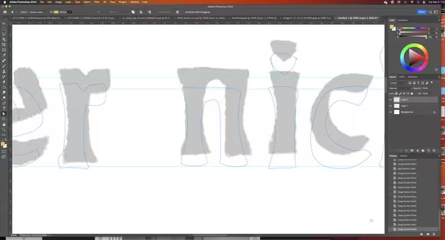
After doing outlines for all the letters and adjusting them for visual balance, I cut and pasted all the paths onto a vector mask over layers of solid black, red, and blue, and eventually ended up with this:

Some of it is guesswork on my part; as a graphic designer I based the “B” in “Blaue” on my knowledge of the type of Art Nouveau typefaces that were in common usage in 1915. Also, on the NZ E.III repro there’s only a single line of lettering in black, with the flag at the end, most likely because of the information they had to work with when it was built; the red letters showed up as black on orthochromatic film, while the blue washed out against the relatively light background of the doped linen and simply disappeared in most period photos. It’s only in a very few that the lettering shows clearly, as in this detail from the Aeronaut Press
Fokker Aircraft of WWI, Vol. II:
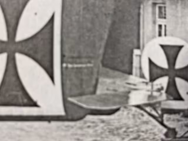
To me it looks like the warnings were meant to be read by the riggers from the front of the aeroplane, as it looks like the “flagstaff” is parallel to the edge of the white field for the national insignia. At least that’s the way I interpreted it, if anyone has evidence to the contrary, please let me know.
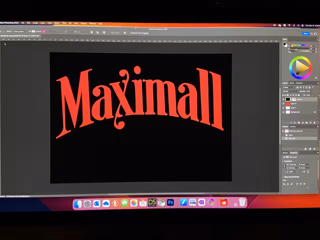
Anyway, as I’m sure many of you know, the advantage of doing this stuff as vector art rather than just drawing it freehand or as a pixel-based “raster” file is that it becomes resolution-independent; for instance this Maximall logo I did for the fuel gauge can be shrunk down to 1:32, or blown up to fit on the side of the Goodyear blimp with no loss of detail (subject only to dpi capability of the printer or display system):
It’d kind of make a cool T-shirt, wouldn’t it?
Dutch