This is a painting which I am creating for an upcoming book on Jasta 30 by German historian Bruno Schmäling. I created the cover art for this book last year but Bruno and the publisher came back to me recently and asked if I would be willing to also create a center spread. The book is scheduled for release in the first half of this year. Unfortunately, various other commitments prevented me from getting started on this project sooner, and as a result, I found myself in a bit of a time crunch to get this finished.
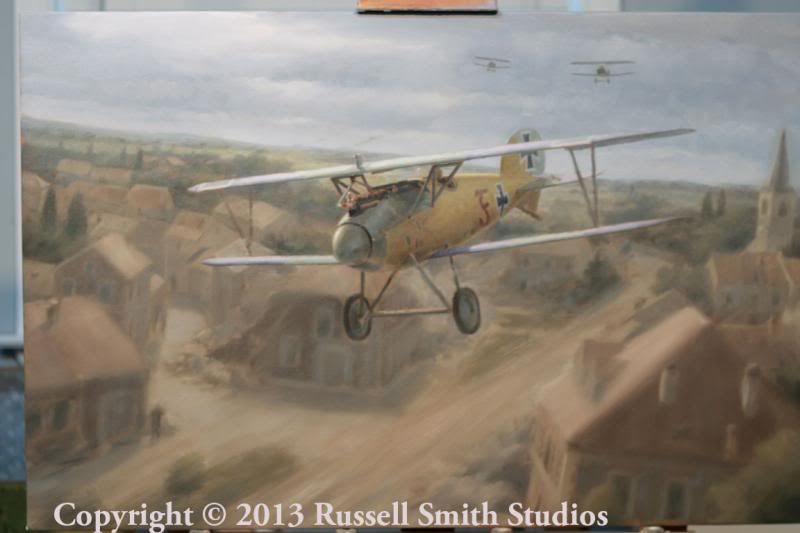
The story behind this image is as follows: In the final week of August 1917, Lt Otto Fuchs took some new pilots up for an orientation flight. Fuchs was flying his Albatros 2140/17 marked with a red "F" on the side. As the flight reached altitude, poor weather began to set in and Fuchs decided to take his flight back to their aerodrome at Phalempin. As they descended they were jumped by a flight of english fighters. Fuchs was the first to be attacked. He allowed his Albatros to spin down below the approaching storm but was pursued by his attackers. Finally reaching treetop level, Fuchs raced along the countryside while having to dodge some of the taller trees and buildings. Gusting winds blew his aircraft around violently and at his extremely low altitude he began to fear that he would be blown into a tree or a church tower. Fuchs was finally able to shake his pursuers by flying into a wall of rain. He set his battered Albatros down in a muddy field and lived to fly another day.
My instruction with this piece was to create an painting showing Fuchs skimming over a French village. The author and the publisher requested that it be clear that he was barely above the tops of the trees and rooftops, and actually below the height of some of the tallest structures. Poor weather and a couple of English aircraft in pursuit were also elements necessary to the story. My final requirement was to feature a view of the Albatros which would allow the viewer to see the red "F" on the fuselage.
A complicated composition such as this is always a challenge to manage. I felt that to convey the story effectively, I needed to show village below Fuchs in order to describe how low to the buildings he was. Placing a bunch of buildings so close behind the subject meant that the background would be complicated and would involve a lot of shapes and lines. It could easily get out of control and compete with, or worse, overwhelm Fuchs’ Albatros. If there is one thing that a painter must try to avoid while creating a composition, it's the dreaded "C" word - CHAOS. However, the scene which i had in mind was very dramatic and dynamic, and I felt that if i could manage the complicated background correctly then it could help to heighten the sense of drama in the painting. But how would I do that? How do you avoid chaos when your subject needs to be dramatic and a bit chaotic? I had to find a way to make the scene feel chaotic while still having an organized and planned compositional flow.
My solution right away was to to blur the background while keeping the Albatros sharply in focus (as if we’re flying along just in front of Fuchs). This offers the twofold effect of giving the viewer a sense of speed while at the same time keeping the viewer's focus on the Albatros. If the background is blurred, then the viewer's eye has nothing to which it can latch on to for any length of time.
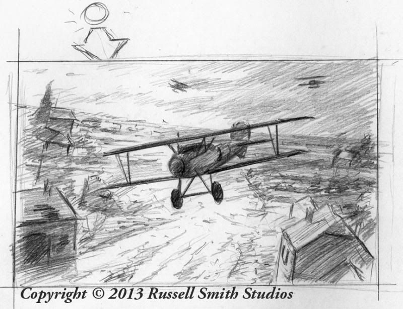
Here is the initial thumbnail sketch approved by the publisher.
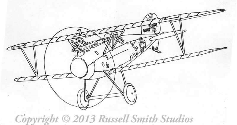
The first task, as always if to create a perspective drawing for the subject aircraft. That's the easy part.
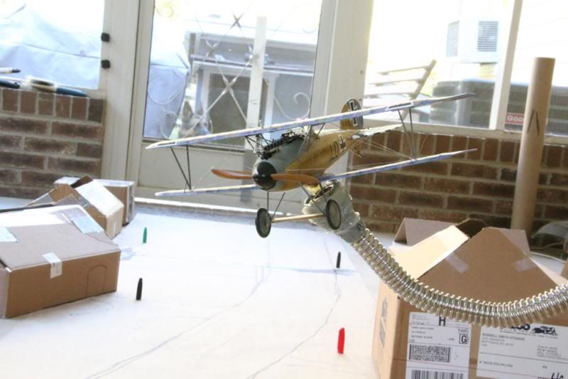
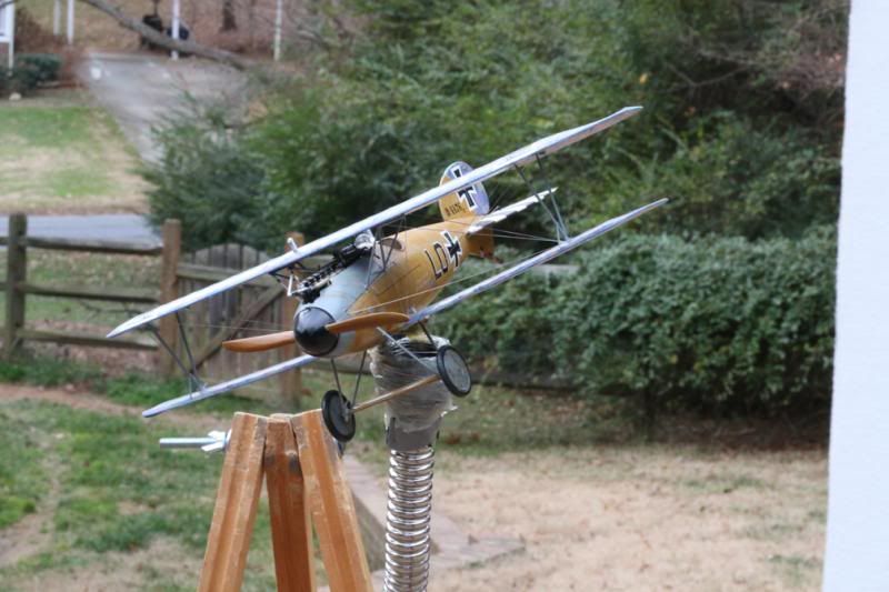
The next issue that I had to tackle was how to create proper perspective for my theoretical village while at the same time establishing a good pattern of darks ands lights. If I had all of the time in the world I could experiment with sketch after sketch until I got it right. Since I was in a bit of a time crunch, though, I needed a palpable visual system that would allow me to see the scene fairly concretely, determine what would and would not work and make changes quickly. Thus, I set about building a mock village from scrap cardboard and then viewing the scene through the viewfinder of my camera. I experimented with several different layouts based on my concept sketch until I had something that I was comfortable with.
(If you're wondering what the small red, green and black verticals are, I estimated that the cap from a Sharpie pen is approximately the same height as a 5'6" human at 1/32 scale)
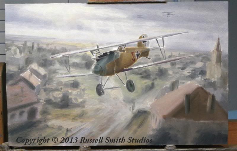
My next step was to create a color study. I skipped over the pencil study at this stage because even though I now had a rough conceptual village in mind, I still had not finished filling in the darks and lights. Darks and lights follow patterns and shapes, and it is much faster to create a shape with a paintbrush than it is with a pencil. I also knew that since this scene is set under heavy, cloudy conditions, this painting won't rely as much on color to set the mood as some of my other works do. Rather, this will be more of a tonal painting which depends on the arrangements of darks and lights to set the sense of drama.Thus I decided that rather than using the color study as a color road map like I usually do, the main purpose this study would be to further experiment with the darks and lights in the background.
I began the study by painting the airplane portion plein air under cloudy conditions. I could immediately see, however, that even under the cloudy conditions I wasn't achieving the sense of drama that I wanted. There was too much ambient light filling the scene. It needed more contrast - in other words darker midtones and lighter highlights - in order to heighten the sense of drama and danger, so I decided to depart from reality slightly for the sake of the story.
The somewhat-finished color study.
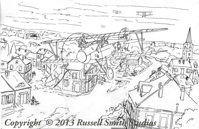
Once I had what I felt was a good pattern of darks and lights I went back to the drawing table and began building my village around that pattern. Using the cardboard village shots as a starting point I then proceeded to draw the rest of the village based on the pattern established in my color study. My first attempt didn't work. The village felt too open - more like a park than a centuries-old French town. The scene needed to be more closed in, with more buildings close to the viewer (in other words, larger shapes). My second attempt was much more satisfying. Using a combination of resources - my cardboard village, my color study, Google Earth, and numerous period photos of French towns - I created a line drawing of the village. It is worth noting at this point that even though I knew that my background would be blurred and much detail would be lost, I still created my line drawing with detail in mind. My feeling is that in order to abstract reality effectively you have to have a firm realistic base to begin with. Many building are still intact, while others have seen the ravages of war and are crumbling and falling.
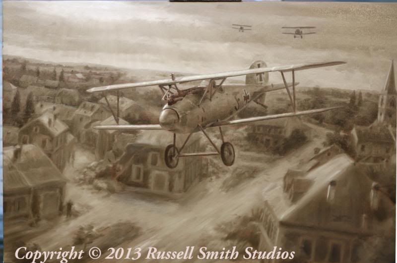
Finally, I reached the grisaille stage. The background was still somewhat busy, and threatened to overwhelm my subject.
Here its is after the first color underpainting. It was still a pretty big mess at this point. However, in addition to the values which I established in the grisaille stage, I now had a basic color map onto which to build subsequent layers. At this point, I still felt like I could make it work.