Hello all,
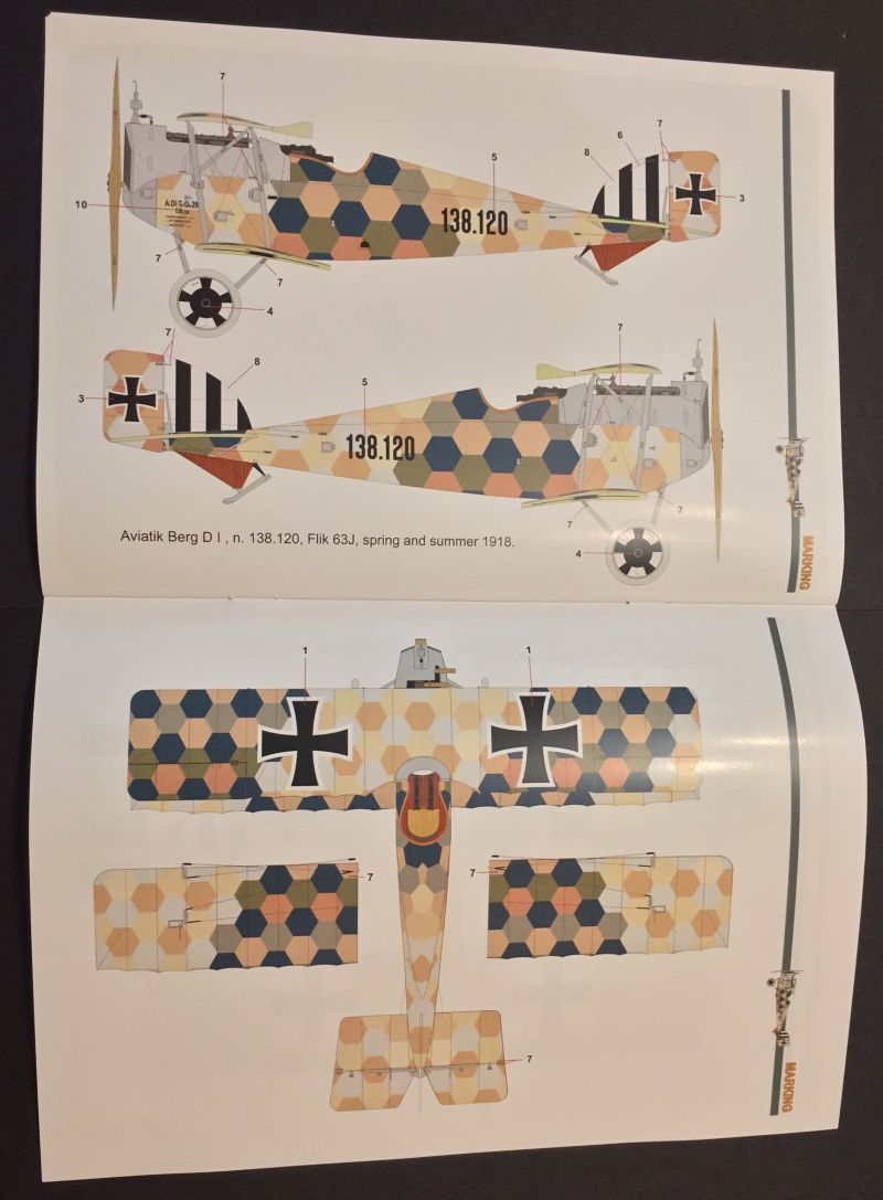
I am no expert at A-H warcolors at all. And as I am building HPHs Aviatik Berg D. I (Aviatik built series 138), I just wondered about the to me unusual colors HPH recommends with its color callouts:

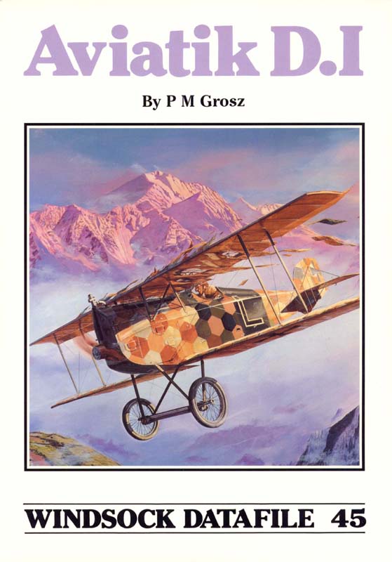
My knowledge - or I should better call it just „memory“ - of those hexagons were much more like that:


In spite of HPH offers an Aviatik built Berg and WDF 45 shows like the flashback boxart Linke- Crawfords Lohner-built Berg, the pattern is quite similar, but the tones are much colder on HPH and much warmer on the latter color depictions.
I tried to get a little deeper into researching, huberlu seems to have had similar questions (
http://www.theaerodrome.com/forum/showthread.php?t=35183).
I learned at least two things:
1. There‘s no definite answer to the question how exactly those Hexagon camouflage looked like in 1918
2. The reason for this is „ There were so many variations from painter to painter, Manufacturer to manufacturer, Fliks, Fleks, and Flaks, a lot of the schemes were applied in the field! Not to mention the variations in colors from batch to batch and sources.“ (I love statements like these, as they give you so much artistic license

)
In short:
Am I completely wrong, when I stick to HPHs general color layout, but go for colors with a warmer shade like on WDF 45?I am not going to use HPHs separately sold decals anyway (because I just don’t like the colors) but the masks that are given with the kit.
Many thanks in advance
Andreas